


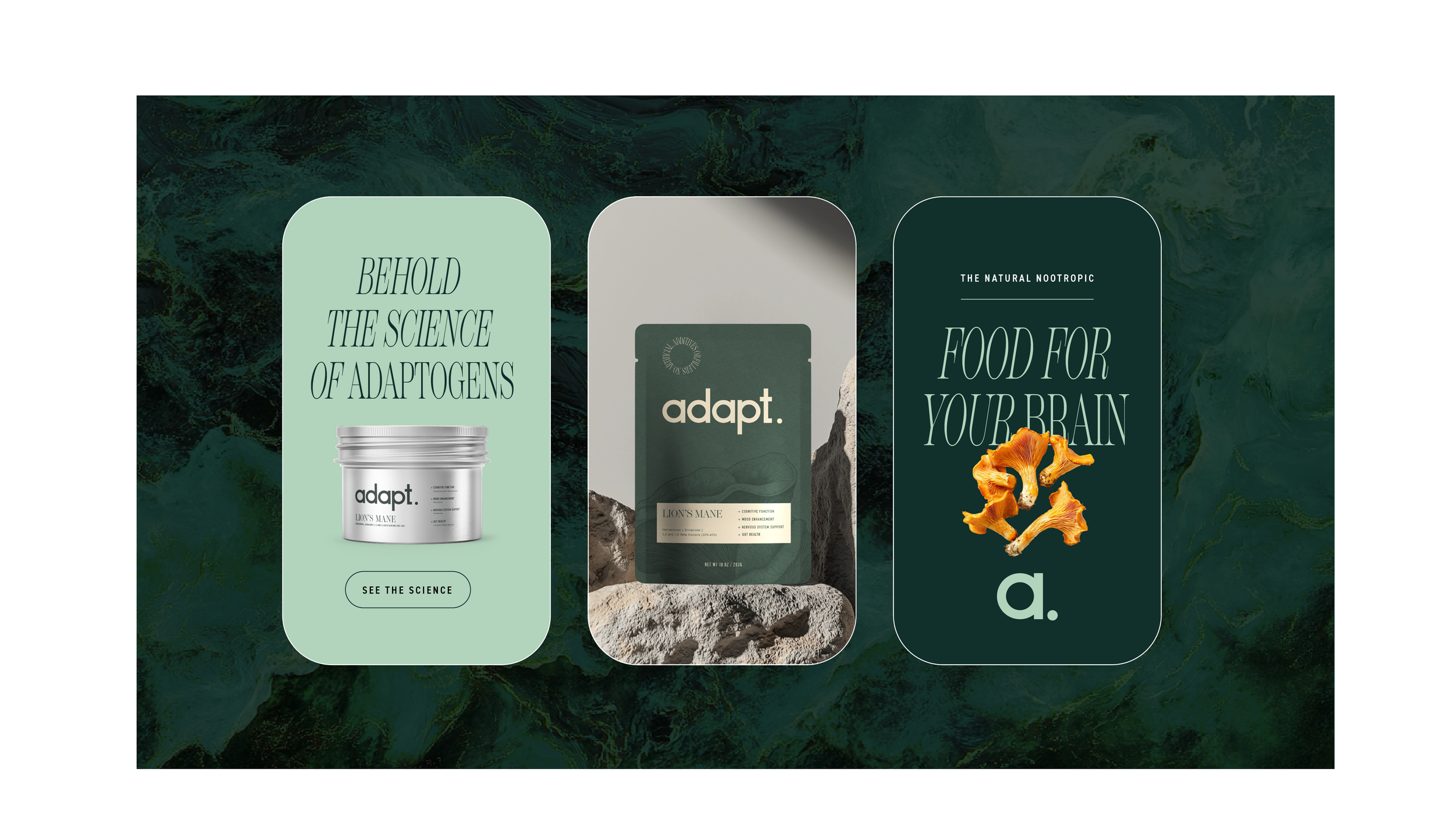
When I was given the opportunity to brand Adapt, I was stoked! As a longtime user of natural nootropics, I already had a solid understanding of the market, but I still needed to dive deeper and research what resonates with consumers. My takeaway? The adatogen market was too complex, the user feels overwhelmed with data and science. My approach was to focus on simplicity and clarity, crafting a brand that truly connects with health-conscious individuals who didn’t want to rely on mystery chemicals for mental clarity. I leaned into a minimalist design and natural tones to cut through the clutter of the supplement market. The goal was to emphasize benefits in a way that felt relatable and approachable without too much daunting and frankly, complex language.
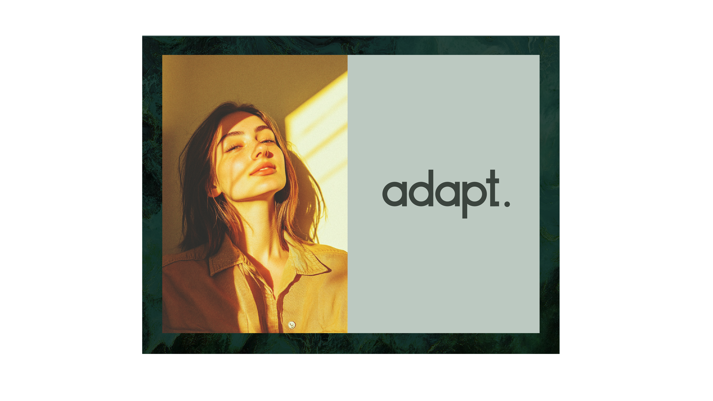
As the Art Director and Creative Director, I wanted the logo to convey a sense of calm and natural simplicity, aligning with the essence of Adapt. I chose a muted color palette of off-white, charcoal gray, and sage green to evoke feelings of balance, wellness, and organic sophistication. These neutral tones are intentionally soft and understated to create a serene, approachable aesthetic that resonates with a health-conscious audience and benefits of Adapt.
For the logo, I created a clean, geometric, sans-serif typeface made from circles and lines. Then contrasted it with a strong, serif font, creating a sense of balance. I wanted the brand to feel approachable and contemporary. The lowercase styling gives it a relaxed, friendly tone, while the bold period at the end of "adapt." adds a sense of authority and confidence. The overall design is minimal yet intentional, positioning Adapt’s commitment to simplicity, clarity, and trustworthiness in an a jargon heavy market.