Dallas College
How to unify 7 colleges into one?
The Dallas County Community College District approached us with a complex challenge: to unify seven independently named and accredited colleges under a single institutional identity—Dallas College. We developed a comprehensive master brand system, including a new logo and visual language, designed to roll out incrementally across web, marketing, and campus signage. The rebrand required careful orchestration to align multiple stakeholders while preserving the legacy and individuality of each campus within a newly unified whole.
Launched at the height of COVID-19, the rebrand helped Dallas College navigate one of higher ed’s most uncertain periods. While community colleges across the U.S. faced double-digit enrollment declines, Dallas College saw only a 4% dip. The new identity achieved full adoption across all campuses within nine months, driving a 65% increase in brand recognition and a 38% rise in social engagement. The work was spotlighted in Brand New and Inside Higher Ed as a model for successful institutional transformation during a crisis.

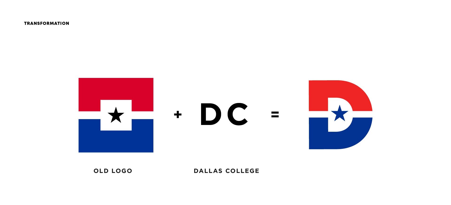
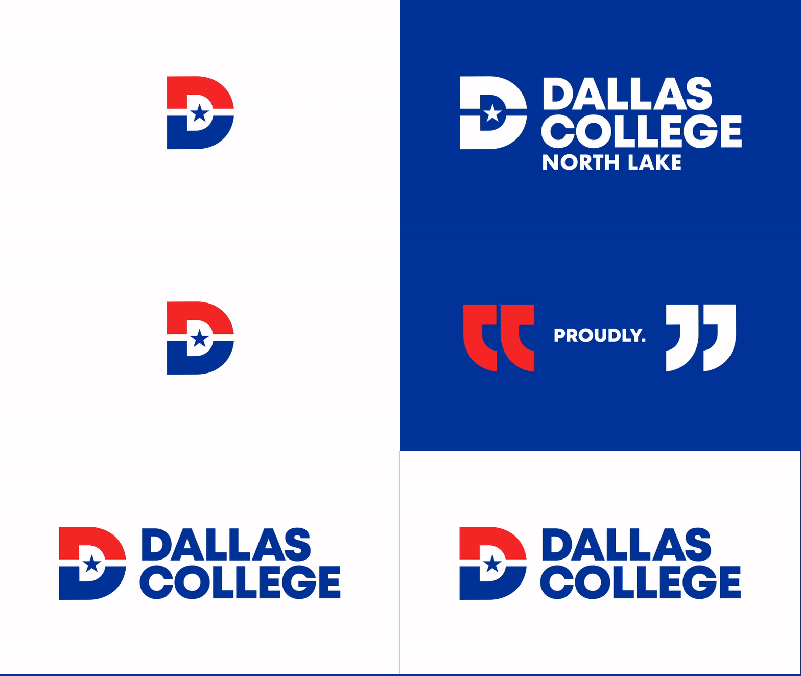
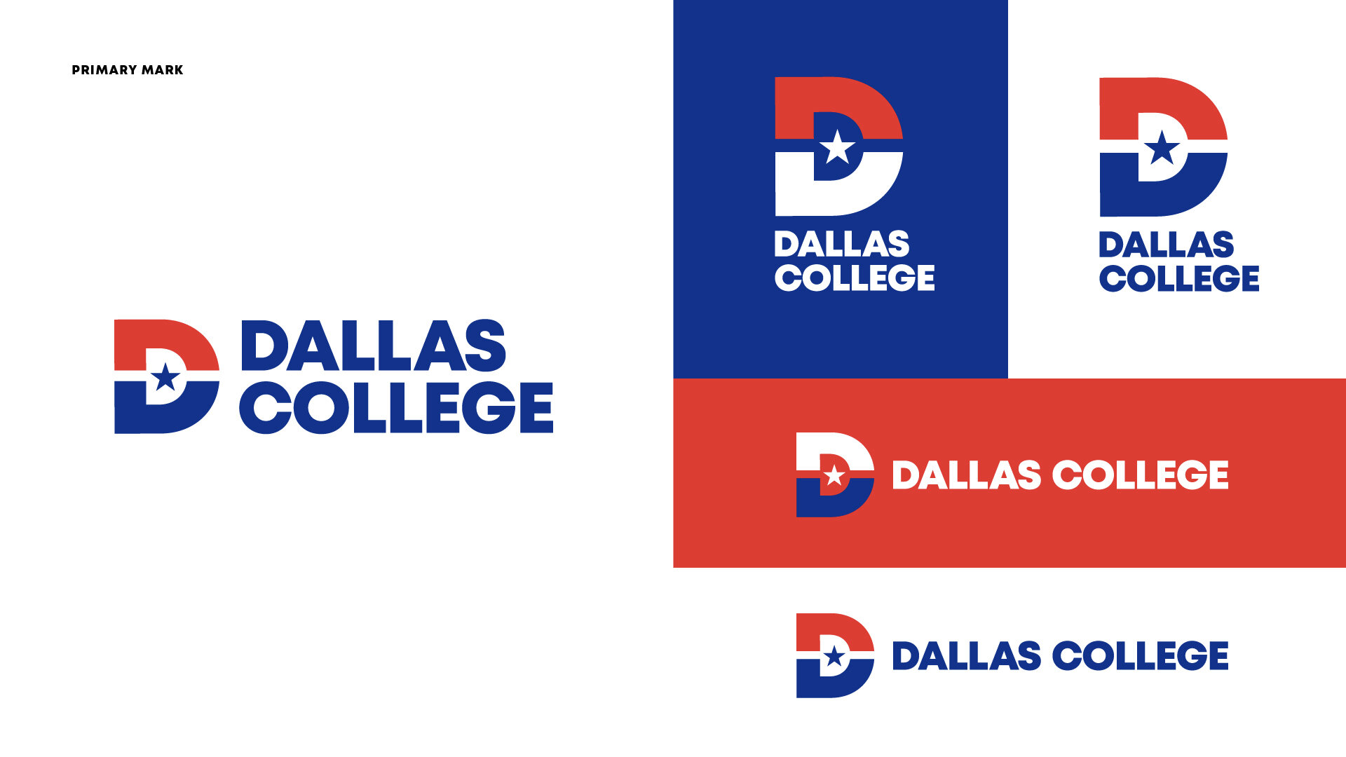
The mark is a progression and expansion of the current branding. This beautifully simple combination of the D and C letters, punctuated with the ever-present single five-point star that flies over all things Texan, creates a bracket shape that comes together to enclose the star, representing the completion and creation of a new entity. That’s the transformation that happens at Dallas College with an education that works.

The existing brand felt outdated, fragmented, and lacked cohesion. To modernize it while preserving its core identity, we began by reimagining the seven campus logos. This involved taking a fresh approach to their design while refining and updating the existing color palette for a more contemporary and unified look.


